WordPress: Buttons
The Button is a custom block developed by the Office of Communications and Marketing.
Purpose
The button is ideal to for a call to action or other task you’d like to encourage the users to undertake.
Availability
This block is only available on the Primary Page and Default page templates.
Elements of the Block
The button has the following user-defined elements:
- visible text
- destination URL
- option to open a YouTube link in a pop up modal
- ARIA label
Adding a Button Block
- With your cursor in the editor in the desired block position, type / to open the block selector
- Start typing the word “button” and after a few characters the chooser will filter the other blocks, leaving the Button as the only option; select it.
Configuring the Button Block
The Button is configured in the right settings sidebar. It’s important that buttons are configured correctly to ensure accessibility requirements are met.
This is especially important if there is more than one button on a page with similar visible text.
There are five customizable parts of the button. Refer to the image and the sections below for explanations. To configure a button, ensure that the button itself is selected in the editor and the the settings sidebar is open.
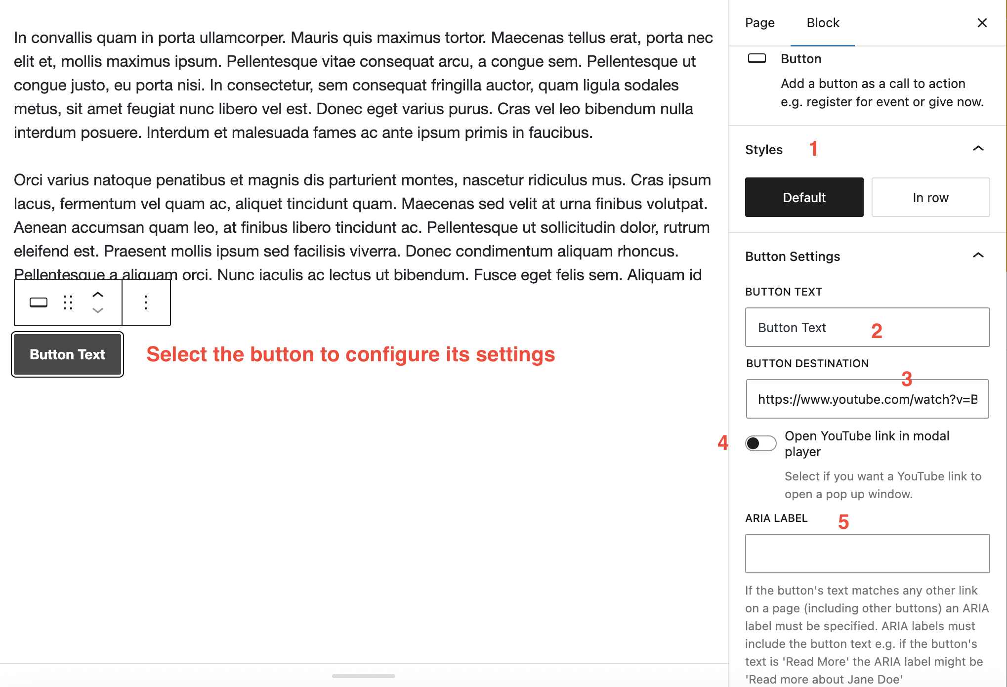
1. Style
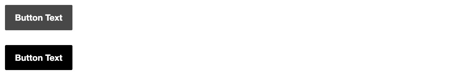
By default, if you add multiple buttons next to each other, they will appear in a stacked layout.
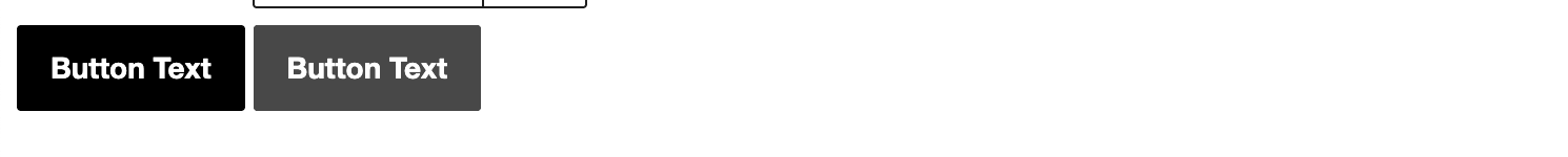
If you wish them to in inline, select the In row styles button. Note: all buttons must have In row selected for them to appear inline.
2. Button Text
Keep text short and descriptive of the action. e.g.:
- Read more
- Learn more
- Register
- Book
These examples appear to contradict the requirement that links (which is what these buttons actually are) make sense out of context by uniquely describing what is at the destination. Please make sure you complete the ARIA label field correctly (see below).
3. Button Destination
The URL of where the users will be taken if the button is clicked.
4. YouTube Popup (optional)
If you enter in the destination field a URL to a YouTube video, another option appears that allows you to set whether the video will open in a popup window. Leave this set to off if wish the link to take the user to the YouTube website.
5. Button ARIA Label
As text such as “Read more” or “Book” can be vague, it is important to configure the ARIA label to give further context.
Ensure that the ARIA label begins with the button text.
Examples
- A button with visible text of “Read More” may have an ARIA label of “Read more about John Doe”
- A button with visible text of “Book” may have an ARIA label of “Book a room at the Claremont Double Tree”
- A button with visible text of “Register” may have an ARIA label of “Register for the San Francisco alumni event”